Graph shows why Banbury was put into Tier Two for Covid restrictions
and live on Freeview channel 276
Health chiefs have shared data showing one of the factors on how they selected the tiers for each county across the country.
The Government announced on Thursday (November 26) what tiered restrictions each county in England will be under when the national lockdown is lifted on December 2.
Advertisement
Hide AdAdvertisement
Hide AdThe whole of Oxfordshire was placed in Tier Two, with neighbouring county Warwickshire put into the highest tier, Tier Three.

Another neighbouring county, Northamptonshire, was placed into Tier Two but the graph shows that it is in the higher section of that tier, close to Tier Three.
The scatter graph shows how the county is in the bottom half of areas that were designated Tier Two.
Many neighbouring villages over the border in Warwickshire are hopeful that their tier will be revised in two weeks, given that they are in the lower section of the Tier Three counties.
Advertisement
Hide AdAdvertisement
Hide AdWhile it is not the only system that was used to decide tiers, the data breaks down on average where some counties in different tiers rank next to one another based on the severity of their infection rate.
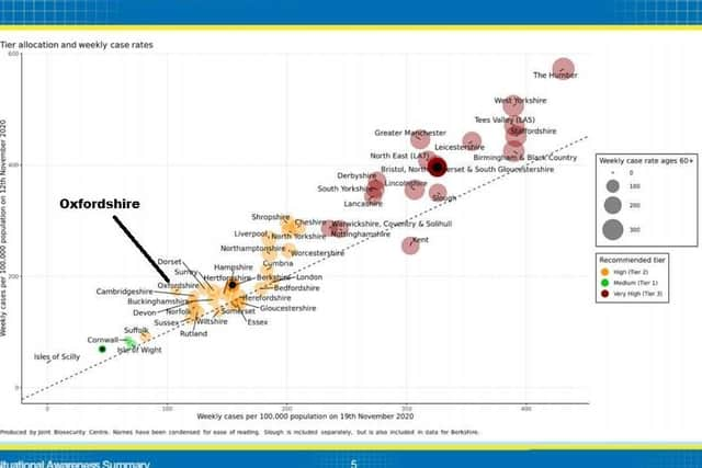
In layman terms, the further to the top right a county places, the more likely they are to be placed in Tier Three.
The graph compares each county's weekly cases per 100,000 population on November 12 and November 19 to gauge how severely the infection rate has grown or shrunk.